Scratch The Surface :: Bob Dylan: Blood On The Tracks

Album artwork: Does it indeed affect our listening experience, and if so, how? Scratch the Surface is a new feature on Aquarium Drunkard that that takes a look at some dubious/in(famous) cover art choices. Not surprisingly, we kick off the series with one of our favorite LPs, Bob Dylan’s Blood on the Tracks.

bloodtrackscover.jpgI’ve always been a fan of rock art, from stickers and show posters to t-shirt designs, but nothing captures the imagination like a great album cover. One of the loudest laments in the digi-age comes from those of us who enjoy a nice, quality piece of art to go with our records. It’s a beautiful thing to hold that 12” square in your hands and pore over it like it’s a key to the record itself; you can’t get that from iTunes clipart. From Pink Floyd to the Beatles to Bob Dylan, up to the Beastie Boys, the National, and Panda Bear, great records have long been covered by great sleeves.

So what do we do when our favorite records start to get uglier and uglier, when we come across a cover so out-and-out bad that the record itself has to fight to be heard? Scratch the Surface, that’s what we do.

Ahh, Dylan record sleeves. There’s the blurred amphetamine burnout of Blonde on Blonde, the fuzzy snuggle of The Freewheelin’ Bob Dylan, the glassy fisheye of Bringing it All Back Home (my personal favorite). There’s the kitchen-sink clutter of The Basement Tapes, which was aped earlier this year by Montreal sprawl-poppers Plants and Animals. Even the pop-art cover of b-sides collection Biograph is cool enough to still be used on Dylan merchandise over twenty years after that record’s release. Each of these covers is iconic, each of them as ingrained in the American mind as the Yankees logo or the flag-raising at Iwo Jima. They’re all validated, of course, by the incredible music found beneath the artwork, but each stands on is own as a textbook example of perfect cover design.

And then there’s Blood on the Tracks. Widely and rightfully considered to be one of Dylan’s best albums, it chronicles his separation from then-wife (and mother of Wallflower Jakob) Sara Dylan and contains many of Dylan’s now-classics (“Tangled Up in Blue,” “Shelter From the Storm,” “Simple Twist of Fate”). It’s an acher of a record: listen to the hurt in Dylan’s voice as he lets her go in “You’re a Big Girl Now” or the lonesome harmonica that kicks off “You’re Gonna Make Me Lonesome When You Go.” Dig the fierce ramble of “Idiot Wind” and the final kiss-off of “Buckets of Rain” (the despair and confusion in “Buckets of Rain” in particular is enough to make a married man weep). It’s a soulful record, to say the least.

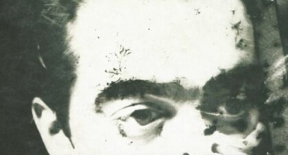
So what on earth is the wet velvet of Blood on the Tracks doing covered by a pixilated, washed-out Dylan and some fuchsia, Nagel-esque graphic design? The sleeve does little to capture the mood of the album, and while it may have been progressive (it predates Duran Duran’s Rio by a good seven years, for instance), it conjures up thoughts of some twitchy Dylan singing through a Vocoder, Trans-style. Biograph, which came out ten years later, is a much more tasteful employment of a similar design aesthetic, one which effectively captures the Bard’s lost, wondering music. Scratch that for Blood on the Tracks; were it not for the record’s epic reputation, I would have most likely never have given it a chance.

Basement Tapes excepted, Blood on the Tracks kicked off a string of bad album covers for Dylan that extended until 1988’s Down in the Groove, and a streak of cover/album disparity that arguably continues to this day. Even 1997’s comeback record, Time Out of Mind, looks more like a beer ad than a classic album. But nowhere in Dylan’s extensive discography is the quality gap between record sleeve and record itself so wide as it is on Blood on the Tracks. I for one still can’t decide which is more disturbing: the sleeve itself or the fact that Dylan thought that its slick, stylized aesthetic was an appropriate representation of the weary soul contained therein. words/marty garner

Discussion: Fellow Dylan fanatics, what do you think of Blood On The Tracks cover art? Love it? Hate it? Indifferent? Sound off in the comments below.

Related: Bob Dylan :: Both Ends of The Rainbow 1978-1989

33 thoughts on “Scratch The Surface :: Bob Dylan: Blood On The Tracks

  1. I’ve always liked the pic on the cover of Blood on the Track, but the format of the lettering isn’t my favorite. At least the cover is better than Empire Burlesque and Shot of Love!

  2. I’ve always been under the impression that the pixelated cover was representative of a blurry state of mind. There was no clarity in Mr. Zimmerman’s life at the time, nothing seemed permanent, or clear. In reaction, the cover of Blood… always felt like a testament to walking through life with eyes half shut…albeit, lyrically he seems totally awake, although very unsure. But you’re right, great album bizarre cover.

  3. great idea for a feature.

    this cover could be loved. i like how the stripe on the side gives it a definite ‘album’ feel. actually it reminds me of a cassette tape cover for some reason. it’s fun to appreciate functional design instead of artistic statements sometimes.

    that said.. sometimes i balk posting about an album because the cover is just too lame to grace the homepage. I will usually suck it up, but for instance on Dale Hawkins’ Tyler Texas record the pose he takes just got too much flair! couldn’t put that one up! 😉

  4. Personally, I’ve never had a problem with the cover art, but after reading this piece and thinking about it I realized I don’t have an opinion one way or another – it’s not strong or weak enough to do so for me. I agree that album art affects the way one listens (or at least the way I listen) – I can think of a few excellent albums with ineffective or cheap art work that I probably don’t like as much as I could because of it (Wilco’s A.M. is the only one that comes to mind right now). I think BOTT is one of those albums where the art is unnoticeable – it doesn’t stand out to me as great, like The Basement Tapes, or particularly bad, like Desire. It’s just there.

    Coincidentally, I posted all of those New York Sessions versions of Blood On The Tracks’ songs earlier this week on my blog, so if you want, come check those out.

  5. I’ve always kinda liked it…although not as much as the previous release (Planet Waves). That being said, your complaint that its merely a Nagel(esque) pixelated blur is THE reason why Dylan is Dylan. He was always ahead of his time. As you stated Duran Duran’s Rio (which popularized Nagel) would not be released for another 6 years. You can probably make an argument that BOTT was an influence on Nagel.

    But more importantly, BOTT was released in 1974! Who even imagined pixelization back then? Computer graphics were not even in existence back then. Yet Dylan visualized the effect while the rest of the computer geeks of the day were keypunching holes into IBM cards…PURE GENIUS!!!

  6. I actually have always kind of liked the album cover on “Blood on the Tracks.” Like the music on the album, the cover art has some sort of soothing aesthetic quality for me. Maybe its because of its seeming simplicity or maybe, like some of the lyrics on the album, its so hard to interpret that you just go with the flow. Rarely do I ever see album covers and go “oh man that’s bad” for artists that I like/love. An example of this for me is The Hold Steady’s “Boys and Girls in America.” Great album, amazing in fact, but some of the WORST album artwork in my opinion. This is a very cool feature I also might add.

  7. I’m going to second McG’s point of view. I think that the pixelated/isolated image of His Bobness matches the overall feel and mood of the record.

    Second, I’ll stick up for this cover design on the basis that it is successful at being iconic. You see it once and it’s burned in memory. It doesn’t require any amount of studying or clue-searching. It’s simplistic and effective.

    And I think the type treatment is cool in a 70’s kind of way.

    You want to talk ghastly, take a look at the cover for “Saved!”

  8. The cover art seems very dated and cheap. While iconic in a way (mainly because it’s Dylan), there is really no creativity here. Very much a period piece.
    What is the analog equivalent for “I suck at Photoshop”?

  9. I’ve loved this album my entire life (it was released just after I was born) so I’ve never even thought about the cover artwork. With a record this good the artwork isn’t a factor for me.

  10. I don’t spend a whole lot of time thinking about album covers, but I will say that as much as I love Dylan, his albums contain some of the most uninspired images of all time. In fact, some of them are just horrible. BOTT is no exception. I don’t see any connection to the mood of the album. It’s just a mid 70’s graphic technique selected by some executive. Aside from Nashville Skyline and Blonde on Blonde, very few others relate to the music within, or are worth a damn artistically. Most are garish and unimaginative.

  11. I am kind of indifferent to the cover design other than it’s color, which is forever screenburned into my thoughts about this record. Whenever I think of it that deep maroon comes to mind, which for me relates to the mood. Beck’s Sea Change and the color of blue on that cover (mine, at least) has the same effect, with a slightly similar mood.

  12. Pixelated, ahh, that wasn’t quite invented yet. Are you all looking at a CD cover? The picture is grainy, the grain evident in the photography process. I always kinda liked the cover. Looks sorta lonely like the songs feel. But I don’t doubt that it was heavily scrutinized like most all design work is. At this level there were most likely many creative people involved. Seems to reflect the times to me. –Brendan

  13. I am indifferent to the cover. like you said, the reputation of the record supercedes the quality of the sleeve design. What IS great though is the painting on the backside. And the nice writing on the back: both great redeeming qualities.

  14. I’ve always found the cover a good match for the music. But this is a must-play album on long road trips for me, usually at sunrise, so the colors and the mood work.

  15. When I first got into Dylan when in high school, buying albums willy-nilly wherever I could find them, Blood on the Tracks was one of the later I purchased, just cause of the album cover. Not know the songs made me weary.

  16. Funny idea for a feature – the chasm b/w an albums cover and its quality. I would say that Nashville Skyline is one of the great Dylan covers too. It totally captures the feel of the record. I think Love & Theft is a cool cover, even though it’s very straight-on, it’s a nice one. Also the cover of Oh Mercy is from a mural that was on 56th St and 8th ave in Hells Kitchenin NYC in the 80s – I made a pilgiriamage to see it when I was working in the neighborhood back then.

  17. Drive up to Hibbing and check out the garage door of Bob’s childhood home…
    Yes, the cover of Blood on the Tracks. Saw it last September. I think the cover is classy.

  18. Seurat intimacy. Dylan offers his profile; he does not want to be looked having delved so deeply within. On the other side another man’s art keeps us at arm’s length, and the dust sleeve’s rich burgundy hides all. The needle drops, and ten extraordinary songs reveal all.

  19. I think BOTT is a great album cover, very muddy and moody: the perfect feel for the album. Everyone keeps saying pixelated, but this is not pixelation, this is pointilism. Pixelation is digitally-based and has a cold, technological feel. Pointilism is an art technique that (through breaking an object or figure down into dots or points) renders a subject hazy or fuzzy, again the perfect feel for this album.

  20. Nice feature! Funny stuff all over-and let’s be honest-the fields of bad cover art are ripe for the picking. Although I don’t know if I agree that there are still great album covers coming out. I’ve never seen the Panda Bear one, but the National has boring covers (…ok, I kinda like the wedding thing on Boxer, but all the others barely look like they took any time or imagination at all). The Silver Jews JUST put out their first album without an ambivalent cover, and it features Babar, King of the Elephants. Not exactly Sticky Fingers, here. And the Hold Steady continue to blow my mind as an amazing band whose music seems to get better and better the worse their album art get. Now they’re trying to create their own Black Flag bars with the Stay Positive ‘infiniplus’ sign. Keep in mind, I’d much rather have the album art be crappy and the music be amazing than the other way around. But, honestly, with the exception of maybe Okkervil River, who’s continued use of Will Schaff’s amazing, constantly evolving art has complimented their artistic growth step by step.
    But, this isn’t about that little rant, this is about your new feature, which I think is great. Next one you do should be TIM by the Replacements.

  21. The original version of this album was completely different than what you pick up in the store today, or from the 80’s on for that matter. The original had a different rear cover and the front was textured much like “The Times They Are A-Changin” which indeed gave way to the grit of it’s contents. You must look at this from the standpoint of buying them when they were released…big albums mean nothing anymore to popular culture and certainly nothing like what they meant to someone in 1975 buying “The new Dylan album” the day it came out!

  22. Great feature! I second Mr. Jenkin’s nomination of TIM for your next ‘scratch the surface’ installment.

  23. I think context is important. I’ve never really thought of it as a bad album cover because I’ve only ever bought/known it in CD format and also I bought the album about 25 years after the fact. Its hard to be subjective about it, because I’ve always just known it, if that makes sense. Its beyond criticism because its iconic.

    His latest album, Modern Times, has a horrible cover. If I was to glance at it in a music shop I’d assume it was one of the budget compilations for drivers who want to stay awake at the wheel and rock out to Foreigner.

  24. If you put it in context of Bob’s own parallel “Paul is dead” rumor, you can look at it as his morgue photo turned sideways while you look for the clues in the lyrics that Bob was not killed in a motorcycle crash, but instead was hit and killed – tangled up – by a train. Yes, there were buckets of tears, and he’s going to make you lonesome when he goes, after all, it’s doom alone that counts when the angel takes his crown of thorns and gives him shelter from the storm. It may have been a simple twist of fate, or an ominous idiot wind, but there is still that morgue photo if you hold the cover sideways, and ponder that Bob was replaced by his own Billy Shearslike look-alike – someone who looks just “like the jack of hearts.” Check out the lyrics for yourself, maybe you’ll see it from “a different point of view.” Life is sad, life is a bust. We’ll meet again someday on the avenue.

    As for “Scratching the Surface,” I find that an amazing title for regular features about album covers, because one of my favorite album covers of all time is the Groundhogs’ “Scratching the Surface.” Hard to explain why – it just amuses me immensely.

  25. Super-humanly lame album cover. The first time I saw it I thought it was a Kmart “best of” Dylan album.

    That version of “Tangled Up In Blue” sounds very similar to “Up To Me” off Biograph (also known as “the greatest Dylan song ever made”).

  26. It’s just one of those things I’ve never questioned. For it to fit my romantic connection to the album it would have to be something more autumnal, but then Dylan would never do something so obvious, save an album cover or two. But then watch the scene in i’m not there when Charlotte Gainsbourg and their children are in a park at fall as “Simple Twist of Fate” fills the air – it’s a mysteriously heartbreaking moment that makes me wonder what a more effective Blood On the Tracks cover could have done to complete the experience.

    But in reality, it is what it is, and the only thing needed to complete the Blood experience is a heart once broken.

  27. Pingback: My Guitar Buddies
  28. I agree with you about the strength of cover art, and I can see why you wouldn’t have listen to that album based on the art – it is not very inviting….
    But on the other hand, as far as the cover being a completion of the album, this cover does work. It is sad , and hazy just like his life must have been at the time.

  29. I always loved the cover art for its grainy, distant, inward quality. The problem I have is that Blood on the Tracks always gets mixed up in my head with Love on the Rocks. Yik.

  30. The anguished faces hiding in his hair. Do you see them?

    Great album art. Greatest album. It breaks my heart every time.

Comments are closed.